
ORDERUP
ORDERUP
A Two-Decade Collaboration
TOOLBOX STUDIOS, PARALLEL BRAND AGENCY, AND SOUPISET DESIGN
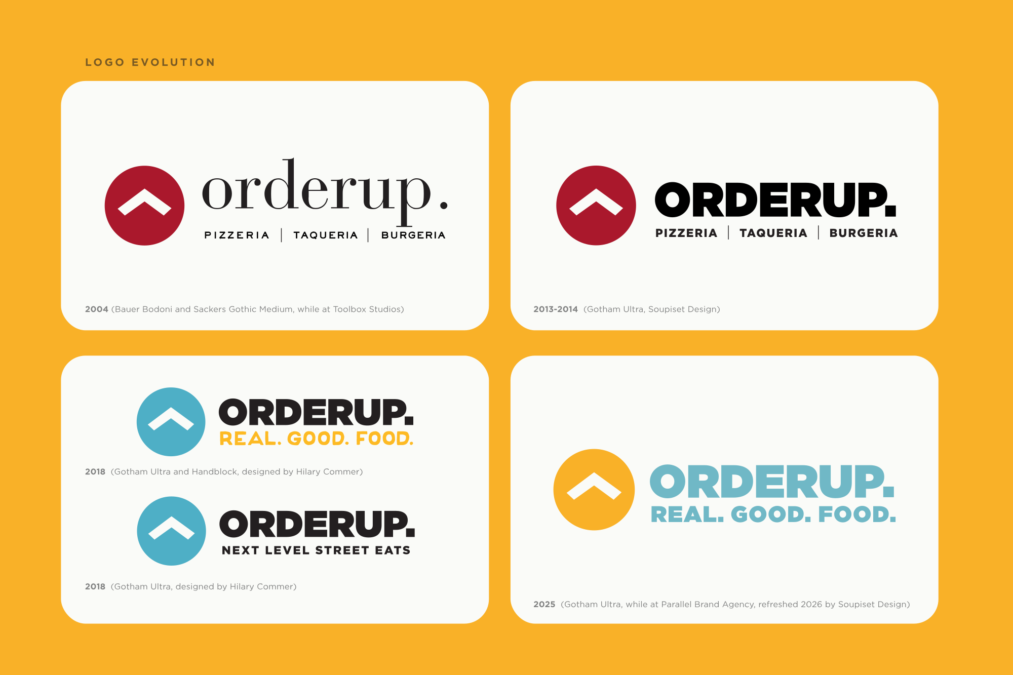
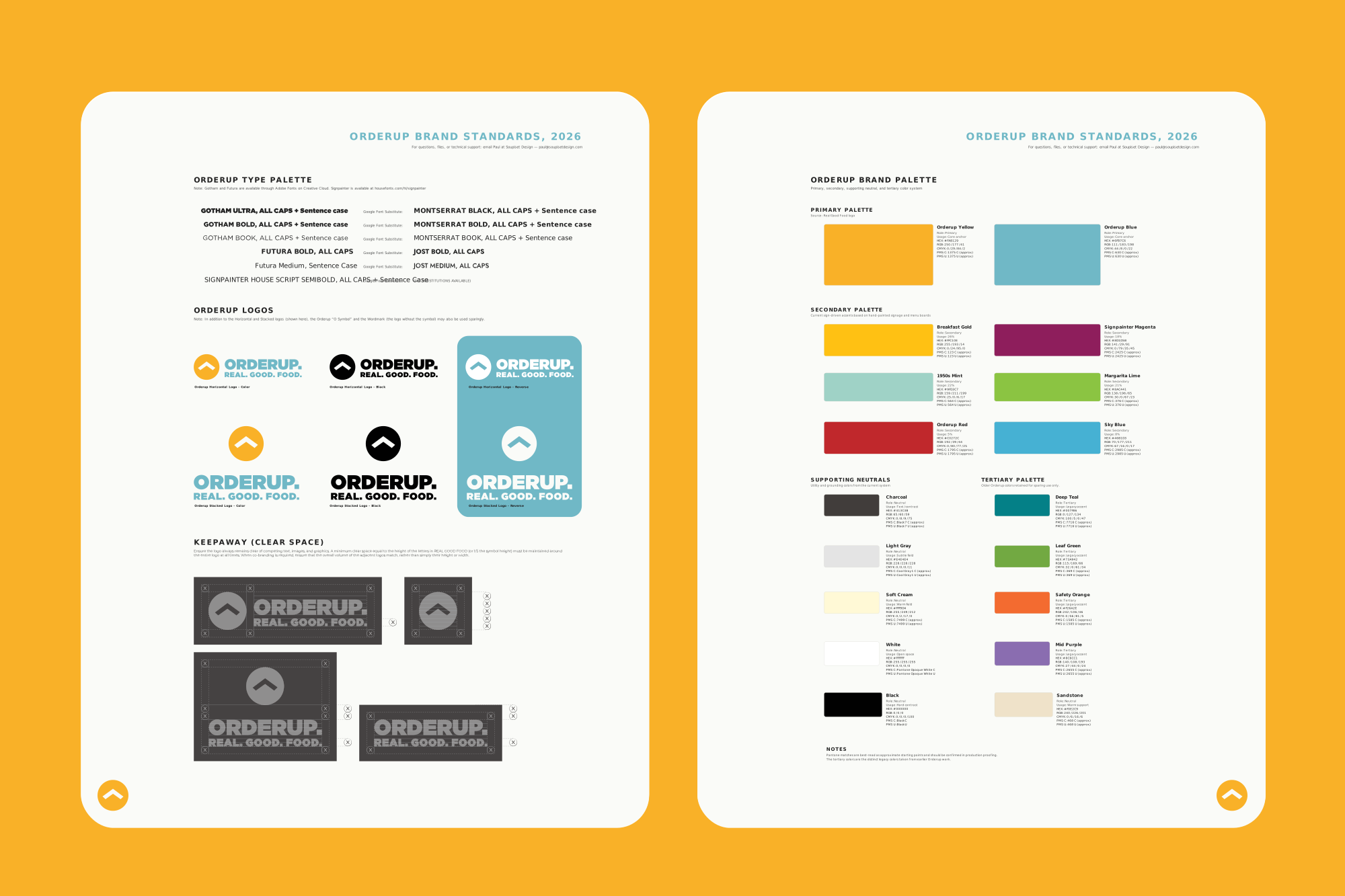


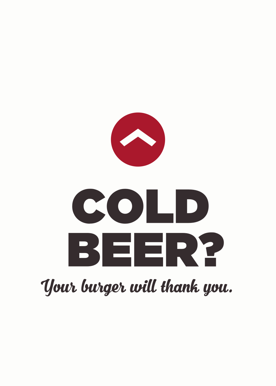
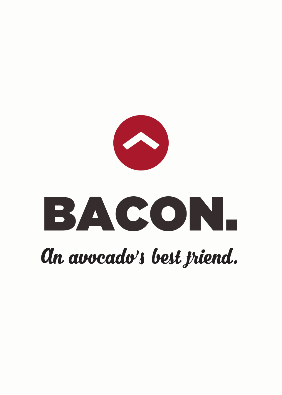


Orderup, over time.
I knew David Galbreath long before he became a restaurateur. In the early 2000s, we spent a lot of late nights talking through what his next chapter might look like and, eventually, what kind of restaurant he might build. David explored everything from creating an international food hall to street food stalls gathered under one roof, then landed on a simpler idea: good food you can eat with your hands. Pizza, tacos, and burgers. Orderup opened in San Antonio in 2004, at the very early edge of what would soon be called fast casual. And “Pizzeria. Taqueria. Burgeria.” was our first tagline.
The name emerged collaboratively from that early brand work (I think David was the one who said the words “Order Up” first, and I smashed them into one word and designed the original identity around a simple “up” symbol: part stylized O, part elevator button, and part shorthand for the idea of taking everyday fast food up a level. The original restaurant was spare and modern: mostly black, white, and red, with clean wood surfaces and a few touches of color on the menu board. I designed the menus, signage, environmental graphics, and advertising that helped establish the brand from the beginning.
Orderup eventually grew to three San Antonio locations, and my job became less about holding the original design in amber than helping it stay recognizably itself as the restaurants evolved. The second location, in the Colonnade, took on a quieter, almost Scandinavian quality, including a floor-to-ceiling forest graphic. The Stone Oak location leaned more contemporary and fast casual, and marked a typographic shift away from the original Bodoni-inspired logotype toward cleaner, widely tracked sans serifs. Menus and core brand elements stayed connected across all three, while architecture, signage, and environmental details responded to each place. At Parallel we delivered a memorable 21st birthday campaign, replete with a “21-Bun Salute.”
David collaborated with architects including Patrick Wynn of TADA and Jonathan Card at Card & Co., who continued to push the Lincoln Heights location through different eras—sometimes more diner-like, sometimes decidedly funkier, sometimes cleaner and more refined.
That evolution has always been part of working with David, whether I was working at Toolbox or Parallel or at Soupiset Design. He is an entrepreneur in the truest sense: curious, restless, willing to try something, live with it, question it, and try again. He has also always given me the freedom to design. He can arrive with a half-formed idea and trust me to listen long enough to understand what is behind it, experiment with where it might go, and tell him when I think something isn’t working (and he can be honest with me when something I design isn’t working either). That trust has carried into other concepts, including Spooniverse! and IZE BOX, but Orderup has remained the longest thread.
Today, the Lincoln Heights restaurant contains layers from many of those years: the Orderup mark outside, the custom chocolate chip cookie neon sign, printed menus and packaging, tray liners, fry cones, to-go bags, hand-painted menu boards, promotional pieces, and remnants of campaigns developed at different points along the way. Other designers, architects, artists, and collaborators have added their own layers, too. It isn’t a preserved version of the restaurant we made in 2004, and it shouldn’t be. For more than two decades, Orderup has kept changing while holding onto the independent spirit, obsessive attention to the food, and slightly unlikely mix of burgers, tacos, and pizza that made the original idea work in the first place.
PROJECT CREDITS
Logo Design and Core Branding: Soupiset Design
Additional Brand Strategy, Concept, Copywriting, Design, and Illustration:
Soupiset Design, Parallel Brand Agency, Toolbox Studios, Hilary Commer
