
ENCHANTED ROCK VODKA
ENCHANTED ROCK VODKA
REBECCA CREEK DISTILLERY
WHILE AT TOOLBOX STUDIOS & PARALLEL BRAND AGENCY

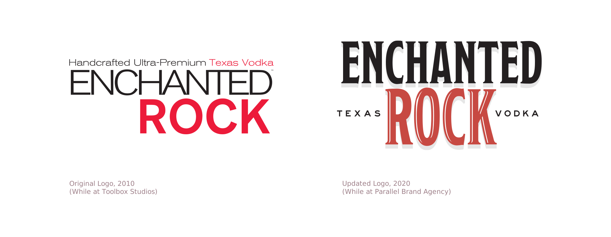
Enchanted Twice.
Enchanted Rock Vodka is one of those rare projects I got to meet twice. In 2010, when Rebecca Creek Distillery was just getting started, Toolbox was hired to design the original packaging for their new Texas vodka and their flagship Rebecca Creek Whiskey. Years later, at Parallel, I found myself back at the same distillery, this time helping rethink the identity and packaging for a brand that had grown up.
This time, we put the name and its Hill Country namesake front and center: a bold new typographic identity based on a custom handtooled Modesto font, a restrained Texas palette, a fresh topographic texture (it happens to be the topo lines for Laity Lodge; a hidden wink and nod), and the silhouette of the rock itself. The package system was designed to extend naturally across future planned flavors (at Parallel, we designed Original and Peach only), while keeping a strong family resemblance on the shelf.
Parallel also built a larger Follow Your Spirit launch campaign around it, setting visual and strategic standards for print, web, social, and beyond, but my favorite part of the story was simply getting to help shape a brand at its beginning, then returning a decade later to help shape what it would become.


PROJECT CREDITS