
H. E. BUTT FOUNDATION
BRANDING THE H. E. BUTT FOUNDATION
A CASE STUDY
SOUPISET DESIGN + TOOLBOX + HEBF


H. E. Butt Foundation Branding
For decades, the H. E. Butt Foundation has built extraordinary programs in the Texas Hill Country with extraordinary loyalty: an adult retreat center, a beloved youth camp, a family camp, free camps for schools and nonprofits, an outdoor education program, and more. People knew and loved the parts they had experienced.
The organization connecting all of those parts was harder to explain.
Beginning in 2012, I became part of a multi-year effort to understand that larger story from a branding lens: first by leading the Foundation through an extensive branding engagement while at Toolbox Studios, and later continuing their brand rollout with Soupiset Design, and later maintaining and expanding the programs’ brand expressions from inside the Foundation as the graphic designer / creative director in its nascent communications department. The work eventually touched research and strategy, naming, identity systems, publications, environmental graphics, maps, program materials, organizational storytelling and launching several new initiatives in San Antonio.
The challenge was to create brand coherence without sameness and let a complex institution better understand itself as a whole without diminishing the character of the programs thousands of people already loved.
Seeing the whole
At the outset, leadership was already working toward a more unified organization, but research revealed a tangle of strong program loyalties, overlapping names, and weak awareness of the parent brand. Working closely with the Foundation’s Perri Rosheger, wekicked off with a robust season of discovery: focus group interviews with Aleigh Sanchez from H-E-B Research and the careful collection of perceptions that had formed around each sub-brand. Wwe mapped constituents, conducted interviews, surveys, and focus groups, developed audience personas, audited communications and the built environment, and built strategic marketing communications roadmaps for individual programs. Our recommendation was to rally around the name H. E. Butt Family Foundation, restoring a family legacy people already recognized while giving the organization a clearer umbrella.
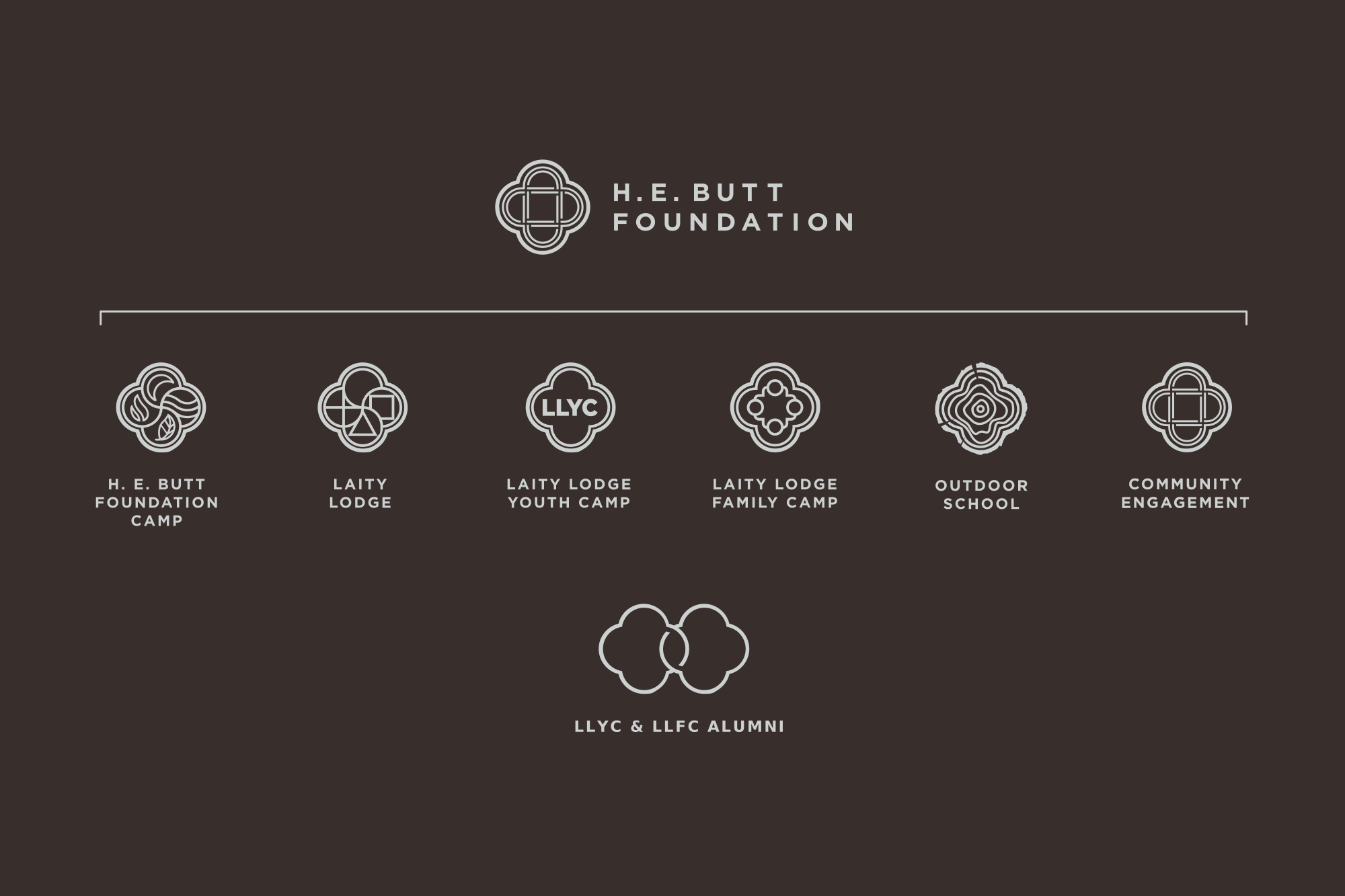
From there, I created the identity for each major program: The original quatrefoil shape, designed by Richard L. Casey in 1978 (and which I had later redrawn in 2012) had, at times, been used as the brand for Laity Lodge—the adult retreat center, the parent Foundation, and other programs, too. We officially assigned the mark to signify only Laity Lodge. Its four-petaled shape and monoline simplicity provided perfect design direction for the entire family of logos.
Later I’d create a more flexible suite of sub-brand logos for Alumni, Quiet House, Headwaters, FOLO Media (assisted by Barack Tamayo), and Mosaic Circle (also a team project). Each logo
had to feel like part of a family, butstill true to its individual personality and purpose.
I also designed the first three iterations of graphic standards guidelines showing how the marks should appear, live together, scale, and be used in the real world.
After the public launch, the work was embraced, even though consistent internal adoption across programs took about a year. It wasn’t overnight, and that was okay. The important thing is that the brand system worked well, the new marks resonated, and the old ones were slowly retired with dignity.
The system then moved into the everyday life of the Foundation: standards, stationery, websites, manuals, registration materials, environmental graphics, trail systems, maps and Canyon-wide wayfinding.
ECHOES
One idea from the original Toolbox branding work kept resurfacing. The Foundation’s existing Connections newsletter could become something more ambitious: I pitched a keepsake-quality flagship publication capable of telling stories across the entire organization, proposing ECHOES as the nameplate in 2014, and by 2016 the idea became real.
Working with Patton Dodd, Marcus Goodyear, and a growing editorial and photographic team, I served as art director and designer for the inaugural issue and designed much of the next ten issues before handing the magazine and brand management over to graphic designer Hilary Commer. Issue One itself was a demonstration of the brand architecture: Laity Lodge’s renovation, LLYC’s fiftieth anniversary, Family Camp, Foundation Camp and the newly distinct Outdoor program all appeared together without losing their individual character.
Expanding Beyond the Canyon
By 2017, Foundation leadership was no longer only asking how its existing programs fit together, but how its resources might respond to needs beyond the Frio Canyon. The 2018 Annual Report—an issue of ECHOES—published the newly articulated mission “to cultivate wholeness in people and institutions for the transformation of communities”, giving the Foundation fresh language for two complementary forms of work: operating programs that nurtured the human spirit, and forming partnerships that strengthened other organizations through collaboration, convening and financial support.
San Antonio became an important missional home base. Early pilots explored mental health, nonprofit capacity building, and public storytelling. I helped translate a growing capacity-building practice into cohort materials, organizational models, and stakeholder tools that nonprofit leaders could actually use. At the same time, we were busy scaffolding Folo Media, an editorially independent nonprofit newsroom created to investigate how inequality affected San Antonio’s children and families, and to introduce people to neighbors they might otherwise never encounter. Folo’s deep listening and neighborliness continued through the Foundation’s later Community Engagement / Know Your Neighbor initiatives.
Looking back, the most important outcome wasn’t an identity system or the hundreds of pieces designed in its wake. We began by helping a collection of beloved but fragmented programs see themselves more clearly as parts of an organization. Research made the needs visible; naming and branding gave them structure; graphic design, photography, environmental and communication systems put that structure into daily use; ECHOES and the new work in San Antonio gave the Foundation places to both listen deeply and to tell its whole story. Good brand systems make complicated organizations look simple. Great brand systems leave enough room for an organization to become something it cannot yet fully imagine.
PROJECT CREDITS